Much was made yesterday of the Fordham Institute's statement from Aaron Churchill, whom I respect and admire, that said the statewide drop in grades on the state's new report card was how students "actually performed" last year.
Beyond the obvious logical issue (weren't previous years' tests also measuring how kids "actually performed" on those tests?), Aaron Churchill's point was that the state's been glossing over the struggles kids have been having for far too long. And now that we have a rigorous test, we will be seeing how kids "really" perform.
I'm sorry, but I just don't see it. And the simple reason is this: Just because kids do worse on this set of tests doesn't mean the old ones were soft or something. How do we know this new round is more accurate? Because test scores dropped?
Could it be that the new tests were bad? If I develop a test designed to get only 1/3 of my students to pass, guess what? It's a bad test and I would be forced to re-write it. I'm not saying the PARCC tests fit that description, but you can't just say the tests are more accurate because kids do worse on them. Unless you're predisposed to think that public schools are failing.
That predisposition reveals the education reform movement's central fallacy: Public Schools aren't doing the job. So advocates become blind to success, or they insist that success means assessments are too easy or something.
Why can't success be, well, success?
I just grow weary of accountability advocates telling us to adopt a rigorous regime, then when kids start doing well at that regime, they tell us that old regime is feeble so we need to adopt an even more rigorous one, which (guess what?) kids will master in a few years too. But for a time, at least, they look like they're not doing as well.
Seems like a self-fulfilling prophecy to me.
I am not against assessments. I think we need to find out how our kids are doing. In fact, educators have been testing and grading kids since, well, forever. The difference today is that these assessments are now being used to do far more than they were ever intended. They drive funding. They drive school closure. They drive levy success. They drive everything.
I'm not even opposed to the Common Core, per se. I like the concepts my kids are learning in math and wish I had learned math that way. I also think it's a good idea to ensure that if a kid moves to Ohio from Tennessee, teachers won't have to catch up the kid for 6 months. My problem is putting so much emphasis on these test results that whole communities suffer and neighborhoods lose their core.
After all, it was none other than Thomas Jefferson who set aside the heart of every American community for "public schools" in the Land Ordinance of 1785.
Assessments need to look at more than analytical ability. That's important, but it's not everything. Creativity, practicality, intuition, critical thinking, love of learning, curiosity, etc. are all as important, if not more so. Yet we do not assess those attributes at all.
This new report card data won't probably end up meaning much because the tests coming in this year are different and there are so many opt-outs, appeals and incomplete data. So I don't know how valuable this set will be beyond this year. I think it's problematic that more than 20% of school district grades are Fs when districts never earned more than single digits in previous years.
Were the single digit years more accurate, or the 20%?
I have no idea. And you know what?
No one else knows either.
Unless you're predisposed to think public schools can't be doing as well as their past test scores suggest, or that public schools are flawless or something. And if that's the case, then you've got a bias that could be blinding you to what could be some great news: that our public schools are doing a great job for the most part, or some bad news: that they need help. Yes, there remain struggles serving at-risk kids. Yes poor kids have less chance of doing well on these tests than wealthy ones. But how do you separate these issues from the tests being inherently tied to demographics?
Overall, I'm damn proud to live in a country whose founders believed the beat to every community's heart started in the classroom. And for those who think our public schools suck compared to anywhere else in the world, look at our economic strength, our creativity, our innovation and compare it with any high-scoring country on international tests (many of the highest-scoring countries 20-30 years ago are in economic chaos today).
And ask a very simple question: Where else would you like to live?
I think America has always has been great. And it is our commitment to Jefferson's heart -- our public schools -- that has played among the most important roles creating that greatness.
Don't let anyone tell you different.
Showing posts with label 14-15 Report Card. Show all posts
Showing posts with label 14-15 Report Card. Show all posts
Friday, February 26, 2016

New Report Card: Greater Percentage of Urban Buildings Meet High-Quality Charter Definition Than Charters
There has been lots of discussion recently about how many charter schools meet the state's definition of a "high-quality" school. The primary state "high-quality" definition is a school with a student growth grade of A or B on the state report card and a performance index (proficiency) grade of C or higher. There are a couple other types of definitions (allowing a charter to receive a B or higher on student growth while showing three years of improvement on performance index, even if it's below a C). But if we want to look at the most exclusive definition, it is the A or B in growth and at least a C in performance index.
Even though about 1/2 of charter students do not come from the state's Big 8 Urban districts (Akron, Canton, Cincinnati, Cleveland, Columbus, Dayton, Toledo, Youngstown), I thought it might be illuminating to use the new state report cards to see how many charters and how many Big 8 urban buildings meet that most exclusive definition.
The results are fascinating.
There are 33 Big 8 Urban buildings that meet that definition, representing 8% of all Big 8 buildings. Those 33 buildings do not include any district-sponsored charter schools. Meanwhile, only 14 of 288 charters (including district sponsored ones) that receive report card grades would qualify. That's a rate of 5%. There are about 100 more charters in Ohio, but they are evaluated under a different system.
So the state's urban districts produce high-quality buildings at a 60% greater rate than the state's charter schools, which only have about 1/2 of their students coming from those urban districts.
And here's how the highest performing buildings in each sector perform:
 High-quality urban buildings produce 60% As and Bs on the report card. High-quality charters produce 55% As and Bs. But it is on the other end of the scale where the performance difference is most profound. That's because while 16.6% of high-quality urban building grades are Ds and Fs, an astonishing 28% of high-quality charter grades are Ds and Fs.
What this is meant to show is something pretty simple: While high-performing charters are out there and are doing amazing things, there are even more high-performing Big 8 Urban buildings that are also doing amazing things. And it's time we recognize their accomplishments as often and vigorously as we're willing to correctly acknowledge high-performing charter school accomplishments.
And while only having 8% of Big 8 buildings meet this most exclusive "high-quality" definition is still far too infrequent, the fact is it's about a 60% more frequent occurrence than in Ohio's charter schools.
What else is interesting that those 33 high-quality buildings come from 5 of the Big 8 districts.
Even though about 1/2 of charter students do not come from the state's Big 8 Urban districts (Akron, Canton, Cincinnati, Cleveland, Columbus, Dayton, Toledo, Youngstown), I thought it might be illuminating to use the new state report cards to see how many charters and how many Big 8 urban buildings meet that most exclusive definition.
The results are fascinating.
There are 33 Big 8 Urban buildings that meet that definition, representing 8% of all Big 8 buildings. Those 33 buildings do not include any district-sponsored charter schools. Meanwhile, only 14 of 288 charters (including district sponsored ones) that receive report card grades would qualify. That's a rate of 5%. There are about 100 more charters in Ohio, but they are evaluated under a different system.
So the state's urban districts produce high-quality buildings at a 60% greater rate than the state's charter schools, which only have about 1/2 of their students coming from those urban districts.
And here's how the highest performing buildings in each sector perform:

What this is meant to show is something pretty simple: While high-performing charters are out there and are doing amazing things, there are even more high-performing Big 8 Urban buildings that are also doing amazing things. And it's time we recognize their accomplishments as often and vigorously as we're willing to correctly acknowledge high-performing charter school accomplishments.
And while only having 8% of Big 8 buildings meet this most exclusive "high-quality" definition is still far too infrequent, the fact is it's about a 60% more frequent occurrence than in Ohio's charter schools.
What else is interesting that those 33 high-quality buildings come from 5 of the Big 8 districts.
|
District
|
Number of High-Quality Buildings
|
|
Akron
|
9
|
|
Canton
|
2
|
|
Cincinnati
|
13
|
|
Cleveland
|
4
|
|
Columbus
|
5
|
So while it's encouraging that kids in most of Ohio's urban districts do have some high-quality options, there remain too few in too few districts.
Thursday, February 25, 2016
New Report Card: Charters Perform Slightly Better in 2 of 9 Categories, Slightly Worse in 1 and Far Worse in 6
Charter Schools have slightly higher percentages of As and Bs in one report card grade category and slightly lower percentages of Ds and Fs than districts in that same report card category, plus another this year. However, districts clobber charters in every other comparable category. By a lot.
The two report card categories where charters outperform districts are in student growth among the lowest performing students and growth among special needs students. In the lowest performing students category, charters had 42.2% Ds and Fs and 27.1% As and Bs. Districts had 49.8% Ds and Fs and 26.7% As and Bs. Meanwhile, in the special needs category, charters had 45.2% Ds and Fs and 24.6% As and Bs. Likewise, districts had 52.1% Ds and Fs and 27.1% As and Bs.
However, the other categories were striking for how much districts outperformed charters. In 5 of the remaining 7 categories, more than 80% of charter grades were D or F. In one other, 70% were Ds and Fs. In Indicators Met and closing achievement gaps (AMO), more than 90% of charter grades were D or F. By contrast, more than 1/2 of district grades in Indicators Met were As or Bs and more than 30% were As or Bs in closing achievement gaps.
The only category where charter performance was even remotely close to districts' was in overall value added, or student growth. While 52.7% of charter grades were D or F and 31.1% were A or B, 48.5% of district grades were D or F and 40.1% were A or B.
So while I expressed concern in my previous post about districts' ability to address the needs of our state's most needy, those concerns are overwhelmed by our state's charter schools' stunning inability to perform across so many report card categories. And even where they do perform better than districts, it's only slightly better.
Let me bottom line Ohio's charter school performance: For a public investment of what is now $1 billion a year, along with 16 years of commitment, we have a charter system that provides slightly better performance than districts in two report card categories, slightly worse in one other and dramatically worse in 6 others.
Remember that charters take about 1/2 their students from districts outside Ohio's urban core.
That's not a performance record one would expect given this state's three-decade policy and financial commitment. Let's hope the state's new found quality focus will change this story. And soon.
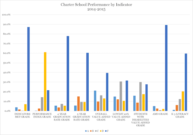
The two report card categories where charters outperform districts are in student growth among the lowest performing students and growth among special needs students. In the lowest performing students category, charters had 42.2% Ds and Fs and 27.1% As and Bs. Districts had 49.8% Ds and Fs and 26.7% As and Bs. Meanwhile, in the special needs category, charters had 45.2% Ds and Fs and 24.6% As and Bs. Likewise, districts had 52.1% Ds and Fs and 27.1% As and Bs.
However, the other categories were striking for how much districts outperformed charters. In 5 of the remaining 7 categories, more than 80% of charter grades were D or F. In one other, 70% were Ds and Fs. In Indicators Met and closing achievement gaps (AMO), more than 90% of charter grades were D or F. By contrast, more than 1/2 of district grades in Indicators Met were As or Bs and more than 30% were As or Bs in closing achievement gaps.
The only category where charter performance was even remotely close to districts' was in overall value added, or student growth. While 52.7% of charter grades were D or F and 31.1% were A or B, 48.5% of district grades were D or F and 40.1% were A or B.
So while I expressed concern in my previous post about districts' ability to address the needs of our state's most needy, those concerns are overwhelmed by our state's charter schools' stunning inability to perform across so many report card categories. And even where they do perform better than districts, it's only slightly better.
Let me bottom line Ohio's charter school performance: For a public investment of what is now $1 billion a year, along with 16 years of commitment, we have a charter system that provides slightly better performance than districts in two report card categories, slightly worse in one other and dramatically worse in 6 others.
Remember that charters take about 1/2 their students from districts outside Ohio's urban core.
That's not a performance record one would expect given this state's three-decade policy and financial commitment. Let's hope the state's new found quality focus will change this story. And soon.

New Ohio Report Card: Too Many Districts Struggle With Most Needy
While the new Ohio report cards continue to show the overall trend of Ohio's public school districts doing a better job overall than Ohio's charter schools, there is troubling data indicating that our districts struggle to improve student achievement for the our most needy students.
When it comes to serving the lowest-performing students, students with disabilities and closing achievement gaps (AMO), Ohio's school districts have about 40% Fs.
And even on student growth, it's feast or famine. The highest percentages for overall value added (student growth) are Fs and As. The disparity is quite stark, with more than 80% of all grades given to school districts being As or Fs. I'm not certain this is in fact the case (I always am suspect about these either-or results), but the data are not encouraging.
Where districts do very well is graduating students. About 1/2 of all grades given on graduation rates for both 4 and 5 year cohorts are As. That's good.
In addition, there were no Fs given for Performance Index scores -- the amalgamated number created to indicate a district's proficiency success. The percentages of As and Bs are down from previous years, though I think that's a function of the PARCC exam slip everyone suspected would happen. But it didn't cause as much of a drop as other states' experiences.
Again, I caution about reading too much into these data because this year's report cards are fraught with opt-outs, safe harbors, tests we aren't going to be using anymore and incomplete ratings in some categories. And these conclusions are based on the extremely limited testing regime currently used.
But these data should cause concern that we are not serving kids who need the most help in enough places.
And while I certainly believe that cutting funding for education, as this governor and legislature have done over the last several years hasn't helped districts cope with the needs of their most at-risk kids (for it tends to be the districts with the most need that have the least ability to self fund their interventions), we must confront these issues as a state and community.
It will indeed be interesting to see how Ohio's charter schools fare in these categories overall -- an analysis I will be performing next.

CORRECTED New Ohio Report Cards: Urban Districts Outperform Charters. But Only 1/2 of Charter Kids Come From There
There's some good news (or bad news, depending on how you look at it) for charter schools in the new state report cards. Charters have slightly lower percentages of Ds and Fs on the state report card than the Big 8 urban districts (Akron, Canton, Cincinnati, Cleveland, Columbus, Dayton, Toledo and Youngstown).
And charters still have 73% Ds and Fs. The Big 8 has 79% Ds and Fs. However, Big 8 urban districts have a slightly higher rate of As and Bs with 14.5% to charters' 14%. Where charters really outperform urbans is on C grades. Urbans barely have any of those grades.
Here's the problem, though. Barely 1/2 of kids in Ohio charter schools come from those districts anymore.
When charters are compared with Ohio school districts overall, they woefully underperform the districts from which nearly 1/2 of their student population originates. And these data don't include the state's worst-performing charter schools -- the Dropout Recovery schools. Those schools have their own evaluation, which is woefully weak, as I pointed out last month.

I caution anyone against reading too much into this year's data for a very simple reason: it probably won't mean much. Many more kids than usual opted out of the PARCC exams last year, upon which many of these grades are based. In addition, schools are receiving safe harbor from these grades because the state switched over from PARCC. Not only that, but many schools and districts are appealing these grades. So they very well could change.
But there are bits of good news here. For instance, when some states switched to the PARCC exams, their grades dropped precipitously. While Ohio's grades did drop, they didn't do so ridiculously by claiming, for example, that only 1/3 of Ohio's kids could read or something.
I will continue diving deeper into these data this afternoon. But overall, these data are telling the same story we've heard now for 16 years -- kids in Ohio's school districts overall are performing much better on state assessments than students in Ohio's charter schools, especially considering that 1/2 of Ohio charter school kids now come from outside the state's urban core.
And charters still have 73% Ds and Fs. The Big 8 has 79% Ds and Fs. However, Big 8 urban districts have a slightly higher rate of As and Bs with 14.5% to charters' 14%. Where charters really outperform urbans is on C grades. Urbans barely have any of those grades.
When charters are compared with Ohio school districts overall, they woefully underperform the districts from which nearly 1/2 of their student population originates. And these data don't include the state's worst-performing charter schools -- the Dropout Recovery schools. Those schools have their own evaluation, which is woefully weak, as I pointed out last month.

I caution anyone against reading too much into this year's data for a very simple reason: it probably won't mean much. Many more kids than usual opted out of the PARCC exams last year, upon which many of these grades are based. In addition, schools are receiving safe harbor from these grades because the state switched over from PARCC. Not only that, but many schools and districts are appealing these grades. So they very well could change.
But there are bits of good news here. For instance, when some states switched to the PARCC exams, their grades dropped precipitously. While Ohio's grades did drop, they didn't do so ridiculously by claiming, for example, that only 1/3 of Ohio's kids could read or something.
I will continue diving deeper into these data this afternoon. But overall, these data are telling the same story we've heard now for 16 years -- kids in Ohio's school districts overall are performing much better on state assessments than students in Ohio's charter schools, especially considering that 1/2 of Ohio charter school kids now come from outside the state's urban core.
CORRECTED New Ohio Report Cards: More than 1/2 of all Charter Grades are Fs. District Grades Drop Too.
I will be posting more details throughout the day on the new state report card data the Ohio Department of Education just released. But the general trends aren't great, especially for charter schools, but also for districts. Then again, it's tough to judge this year's results because they were based on tests we don't administer any more and there are protests, appeals, opt outs and other complications that make dealing with this year's report card uniquely troublesome.
But overall, 53% of charter school grades released today are Fs. More than 70% are Ds and Fs. Meanwhile, more than 60% of district grades are A, B, and C. Though more Fs were given to districts than at any time in the past, with about 21% of district grades being Fs now. Though more than 40% of all district grades are As and Bs. Meanwhile, less than 15% of charter grades are As or Bs.
I need to combine the grades issued last month with these grades to get an overall report card status, but I believe the percentage of Fs will increase for charters after graduation rate grades are factored, while I think the percentage of Fs will drop for districts once those data are included. But stay tuned.
Here's the percentage of grade distribution for the grades released today:

But overall, 53% of charter school grades released today are Fs. More than 70% are Ds and Fs. Meanwhile, more than 60% of district grades are A, B, and C. Though more Fs were given to districts than at any time in the past, with about 21% of district grades being Fs now. Though more than 40% of all district grades are As and Bs. Meanwhile, less than 15% of charter grades are As or Bs.
Here's the percentage of grade distribution for the grades released today:

Subscribe to:
Posts (Atom)